
Why Pantone’s Color of the Year Feels Like a Collective Exhale
By Alexus Mosley
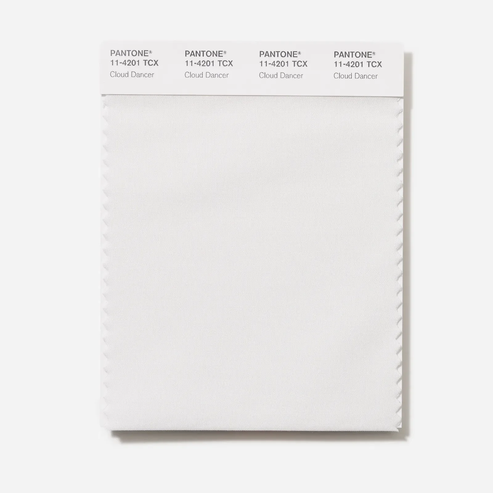
Image Credit: Pantone
Today, the world is noisier than ever. Our beloved (or detested) electronic device allows for constant tragic news updates, endless opinions from the qualified and unqualified alike, and continuous accessibility that leads to many of us subconsciously feeling as though we have to always be “on.” In this new world, quiet has become a rare luxury. And with its 2026 Color of the Year, Cloud Dancer, Pantone seems to be acknowledging exactly that.
Described as a soft, airy, Serena-white hue, Cloud Dancer isn’t a color that I’d usually root to be the color of the year. Typically, in the early days of December, I await the announcement, hoping for a shade that demands much attention to be unveiled. Something that sparkles, preferably pink. But PANTONE 11-4201 doesn’t sparkle. Instead, it offers something far more rare in today’s cultural climate, and that is calmness and space. Space to breathe, reflect, and begin again.
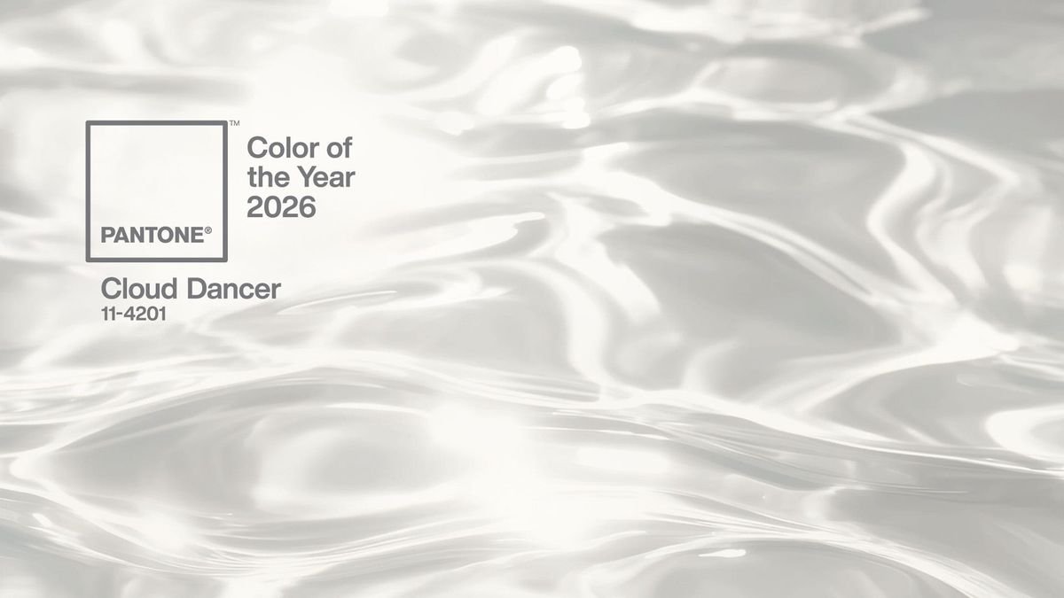
Image Credit: Pantone
Given that Pantone’s Color of the Year has a significant influence on the design of fashion, home decor, branding, and product design worldwide, in a culture obsessed with the next “big thing,” I expected a statement shade that could cut through the algorithm. Maybe a bold neon or a shade amongst the saturated brights. But Cloud Dancer suggests a turning point, signaling restraint, neutrality, and calm rather than maximalism and urgency.
But, this isn’t minimalism for minimalism’s sake or the appearance of being chic. Make no mistake that this decision is tied to fatigue. The collective is absolutely exhausted. Whether it’s performing identity, the productivity rat race, or the weight ofg public opinion. But in the thick of it all, Cloud Dancer feels like the cultural equivalent of lowering the volume. As though it’s playing the role of a blank canvas. What makes this color particularly compelling is its role as a blank canvas. Unlike previous colors of the year, Cloud Dancer doesn’t impose meaning. Instead, it invites us to assign our own. In fashion, it echoes the continued rise of quiet luxury and intentional dressing, choosing pieces for longevity instead of virality. Its serene hue aligns with softer palettes that prioritize light, air, and emotional ease, reflecting a return to clarity over clutter.
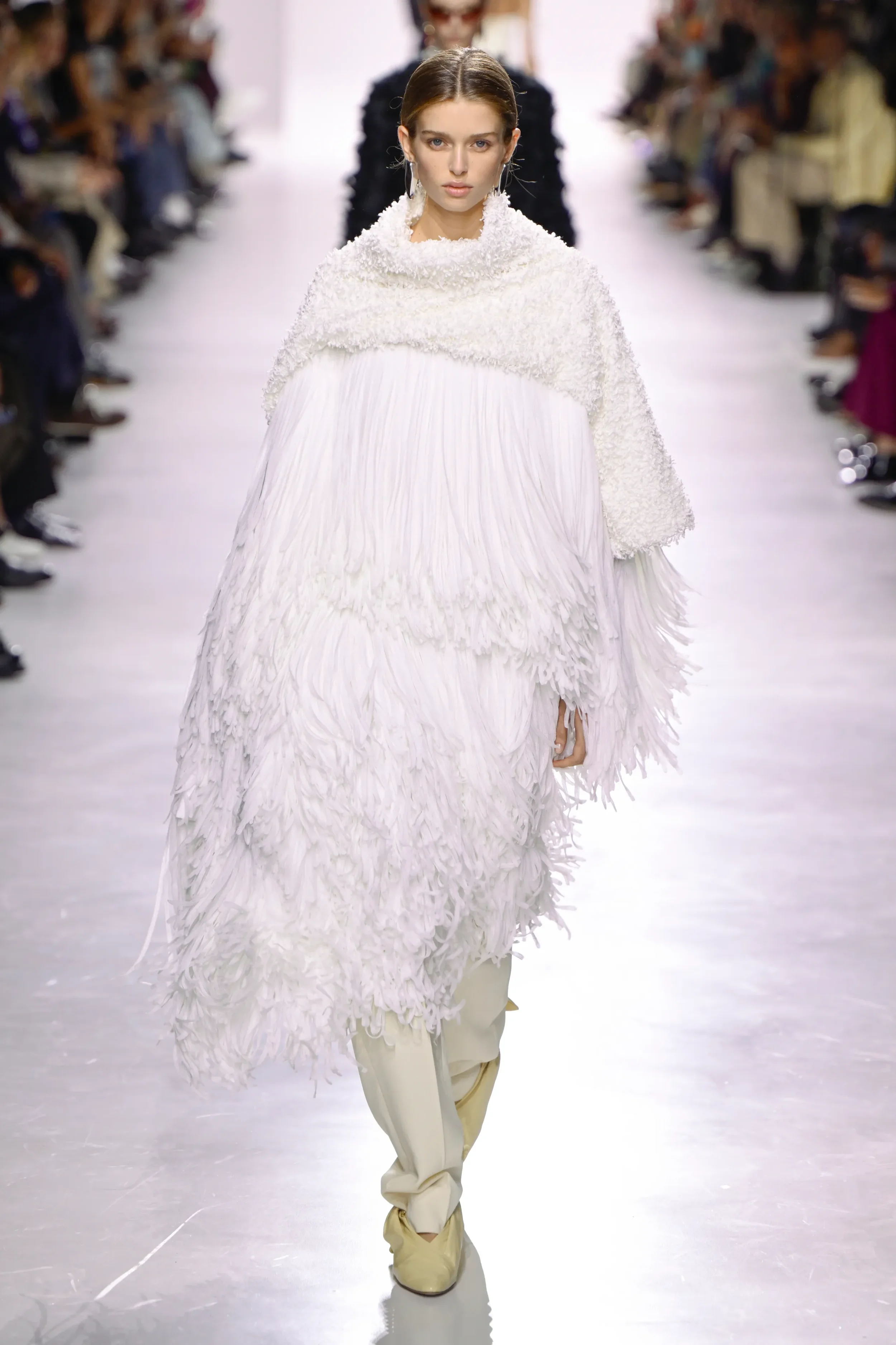
Bottega Veneta fashion show as part of Spring/Summer 2026 Milan Fashion Week
Getty Images
This points to a renewed desire to create without constant commentary and making art, ideas, and decisions from a grounded place rather than the quickness rewarded by social media algorithms. Does this mean calm will become a cultural value? It appears that in a society that often associates the loudest voices with power, choosing softness will become a sign of dominance. This milky tone suggests that clarity, intention, and restraint are not signs of disengagement but of discernment.
Ultimately, after years of saturation, Pantone’s Color of the Year feels like permission to pause. Cloud Dancer is a cultural mirror, reflecting a shared longing for peace, for simplicity, for room to think and feel without interruption. And perhaps that’s exactly what this moment needs. Not another statement, but a breath.
Is Consumerism Driving Us All Insane? The Psychology Behind Our Shopping Obsession